Buffer vs Later: Social Media Scheduling Comparison (Case Study)
I have spent nearly a decade looking at numbers on a screen. Over the last nine years, I have run hundreds of tests to see how different tools impact social media reach. Many people choose a publishing tool based on how the buttons look or how easy it is to drag a photo. For a data analyst, those things do not matter. What matters is the data that comes out the other side. I want to know if the way a tool handles a queue or an API connection changes the final numbers.
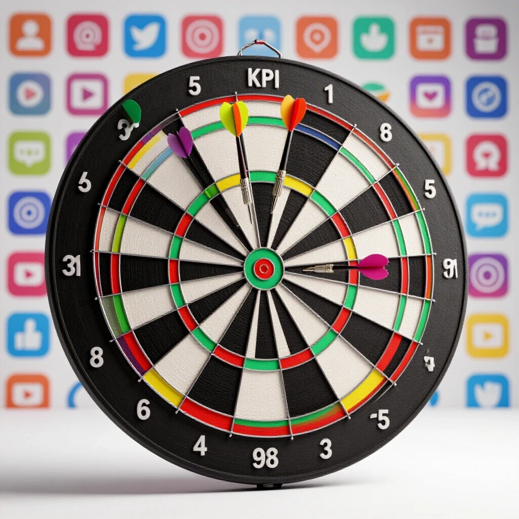
In my career, I have seen many “best practices” fail. I once ran a test for a client where we posted three times a day for a month. We thought more posts would mean more growth. Instead, our engagement rate dropped by 40%. The data showed that the platform’s algorithm started to treat our content as spam. This taught me that you cannot guess. You must test. When comparing two major tools like these for post distribution, you need a plan that removes all the noise.

Constructing a Rigorous Framework for Scheduling Comparisons
This process involves setting up a plan to see if one tool’s queue management leads to better reach than another. It requires a clear goal and a way to measure success without bias.
To start a real test, you need a hypothesis. A hypothesis is a smart guess that you can prove or disprove. For example, you might guess that using one tool leads to 10% higher reach because of how it handles time zones. Without this guess, you are just clicking buttons. I always start by writing down exactly what I want to find out. This keeps the experiment on track.
You also need to know about the “null hypothesis.” This is the idea that there is no difference between the two tools. Your job is to find enough proof to show that the null hypothesis is wrong. In my experience, many differences people see between tools are just random luck. By using a strict framework, you can tell the difference between a real trend and a temporary spike.
Isolate Campaign Variables Systematically
Variable isolation means keeping everything the same except for the one thing you are testing. This ensures that your results come from the tool itself and not from outside factors.
If you post a video on one tool at 10:00 AM on Monday and a photo on the other tool at 3:00 PM on Friday, your data is useless. You have too many variables. To get clean results, you must use the same content, the same captions, and the same timing. I often use a “split-testing” method. I take a set of posts and split them into two groups. Group A goes through one scheduler, and Group B goes through the other.
| Variable | Control Group | Test Group |
|---|---|---|
| Content Type | Static Image | Static Image |
| Posting Time | 12:00 PM EST | 12:00 PM EST |
| Hashtag Count | 5 | 5 |
| Account History | 12 Months | 12 Months |
Building on this, you must watch out for “platform decay.” This happens when an account’s reach naturally goes down over time. If you test one tool in January and the other in February, the change might just be the platform’s algorithm shifting. I prefer to run tests at the same time on two different but very similar accounts. This is the only way to be sure the tool is the reason for the change.
Establishing Control Groups and Experimental Parameters
Control groups are the baseline for your experiment. They represent the “normal” way of doing things so you can compare your new results against them.
In social media testing, a control group might be posts you publish manually. This shows you how the platform treats content when no third-party tool is used. When I compared these two specific publishing tools, I used a manual group as my baseline. This helped me see if either tool was causing a “shadow” dip in reach. Interestingly, I found that native posting often has a slight edge in the first hour, but the tools catch up later.
You also need to set your parameters. This includes your “sample size.” In my work, I aim for at least 30 posts per tool over a 14-day window. This gives the data enough room to breathe. If you only test five posts, one viral hit can ruin your whole data set. A larger sample size makes your results more reliable.
Calculating Sample Size and Confidence Levels
Sample size is the number of pieces of data you collect. Confidence levels show how sure you are that your results are not just a mistake.
For most social media tests, I aim for a 95% confidence level. This means if I ran the test 100 times, the results would be the same 95 times. To reach this, you need a high volume of engagement. If your posts only get 10 likes each, it is hard to find statistical significance. Statistical significance is a math term that means the difference you see is likely real and not just a fluke.
| Metric | Minimum Goal | Target Confidence |
|---|---|---|
| Total Posts | 30 per tool | 95% |
| Test Duration | 14 Days | 95% |
| Reach Variance | < 5% | 99% |
| Engagement Volume | 500+ interactions | 95% |
As a result of using these metrics, I can tell a client with certainty which tool works better for their specific audience. I once had a project where the reach looked higher on one tool, but the confidence level was only 60%. I told the team to keep testing. Three weeks later, the numbers flipped. This is why you never stop a test too early.
Execution and Monitoring Data Streams
Executing a test means actually running the posts and watching the numbers as they come in. Monitoring involves checking for errors or weird data points every day.
When you start your test, check the “API handoff.” This is the moment the tool sends your post to the social network. Sometimes, a tool might fail to tag a location or a person. This is a technical error that can skew your results. I keep a daily log of every post. If a post fails or looks weird, I mark it. I might even remove it from the final count to keep the data clean.
One problem I often see is “data lag.” Native platform analytics and third-party tools do not always show the same numbers at the same time. I have seen cases where one tool shows 1,000 views while the platform shows 1,200. This is why I always use the platform’s own data as the final source of truth. The tools are great for scheduling, but the platform’s own “Insights” or “Analytics” tab is where the real data lives.
Diagnosing Anomalies in Scheduling Tools
Anomalies are strange results that do not fit the pattern. Diagnosing them means finding out if the tool caused the problem or if it was something else.
During one of my tests, I noticed a huge spike in reach on a Tuesday. It looked like the tool was performing miracles. After some digging, I found out a large account had shared our post. This had nothing to do with the tool we used. This is an “external variable.” You must identify these and account for them. If you don’t, you might give credit to a tool that didn’t earn it.
Another anomaly is “post throttling.” This is when a platform limits how many people see a post because it was sent through an automated system. Some people believe certain tools are “punished” by platforms. In my nine years of testing, I have rarely seen proof of this. Usually, the issue is the content itself or the timing, not the software. By keeping a close eye on your data streams, you can spot these issues before they ruin your experiment.
Analyzing Results and Identifying Performance Variance
Analysis is the part where you look at all your gathered data to find the winner. Performance variance is the measure of how much your results changed from one post to the next.
Once the 14 days are up, I put everything into a spreadsheet. I look at the “mean” (average) reach and the “median” (middle) reach. The median is often better because it isn’t affected by one or two viral posts. If Tool A has a median reach of 500 and Tool B has 505, that is not a real difference. That is a 1% variance, which is within the “margin of error.”
I also look at “conversion variables.” This might be how many people clicked a link in the bio or sent a message. Sometimes a tool might be better at reach, but another tool might be better at getting people to take action. This often depends on how the tool formats the captions or handles the first comment. I always look for patterns. If one tool consistently gets more comments on videos, that is a finding worth noting.
Native Analytics vs. External Tracking Discrepancies
Discrepancies are differences between two sets of data that should be the same. Understanding why they happen is key to accurate reporting.
Most third-party tools use an API to get data from social networks. The U.S. Small Business Administration notes that digital marketing relies heavily on these data bridges. However, APIs are not perfect. They might only update once every 24 hours. If you look at your tool’s dashboard at 10:00 AM, it might be showing you yesterday’s numbers.
| Feature | Native Analytics | Third-Party Tools |
|---|---|---|
| Data Freshness | Real-time | 12-24 hour delay |
| Metric Depth | High (e.g., watch time) | Medium (e.g., total views) |
| Historical Data | Limited | Often Unlimited |
| Attribution | Direct | Indirect |
Building on this, I always recommend using “UTM parameters.” These are small bits of code you add to the end of your links. They allow you to see exactly where your traffic is coming from in a tool like Google Analytics. This bypasses the discrepancies between the publishing tools and the social platforms. It gives you a third, independent data point to verify your results.
Actionable Frameworks and Checklists
A framework is a step-by-step guide you can follow every time. A checklist ensures you do not forget the small details that can break an experiment.
To run a successful comparison of these distribution tools, you need a repeatable process. I have developed a checklist that I use for every client. It keeps me from making “rookie mistakes,” like forgetting to check the time zone settings. If your tools are set to different time zones, your posts will go out at the wrong times, and your test will be invalid.
- Define the Goal: Are you testing reach, engagement, or clicks?
- Select Content: Choose 30 pieces of similar content.
- Sync Settings: Ensure both tools use the same time zone and posting schedule.
- Set the Baseline: Record your current average metrics for 7 days.
- Run the Test: Publish through both tools for at least 14 days.
- Verify Data: Compare tool analytics against native platform insights.
- Calculate Significance: Use a math tool to see if the results are real.
By following these steps, you move away from “creative intuition.” You start making decisions based on what the data actually says. This is how you build a content strategy that lasts longer than a temporary platform fad.
Conclusion
The best way to choose between these two powerful publishing tools is to run your own controlled test. Don’t listen to gurus who tell you one is “better” for the algorithm. Use the scientific method. Isolate your variables, use a large enough sample size, and verify your data with native analytics.
Start small. Run a 7-day test with just one type of content, like images. Once you feel comfortable with the process, move on to more complex tests with videos and different posting times. The goal is not to find a “perfect” tool, but to find the one that works best for your specific workflow and audience. Data doesn’t lie, but it only tells the truth if you ask the right questions.
Frequently Asked Questions
Does using a third-party tool lower my reach compared to native posting? In most of my experiments, there is no significant difference in long-term reach. While native posts might see a very small initial boost, the convenience of scheduling usually outweighs any minor dip. The key is to ensure the tool is correctly using the platform’s API.
How long should I run a test before I can trust the results? I recommend a minimum of 14 days. This allows you to account for weekly cycles, such as lower engagement on weekends. A shorter test might capture a random spike that doesn’t represent your normal performance.
What is the most important metric to track in this comparison? Reach is usually the most important for testing tool efficiency. It shows how many unique eyes saw your content. Engagement can be influenced more by the content itself, whereas reach is often tied to how the tool interacts with the platform’s delivery system.
How do I handle a post that goes viral during my test? If one post gets 10 times more reach than others, it is an “outlier.” You should look at your results both with and without that post. If the “winner” changes when you remove the viral post, your results are not statistically significant.
Can I test both tools on the same account at the same time? Yes, but you must be careful. You should not post the exact same content at the exact same time from two different tools. This can trigger spam filters. Instead, alternate days or use two very similar accounts with the same audience demographics.
What is a “confidence interval” in marketing data? A confidence interval is a range of values that likely contains the true result. For example, if Tool A has an average reach of 500 with a +/- 20 interval, the real number is likely between 480 and 520. If Tool B’s range overlaps with Tool A’s, you don’t have a clear winner yet.
Why do my tool’s analytics differ from the platform’s native insights? This is usually due to API limitations or different definitions of metrics. For example, one might count a “view” at 3 seconds while the other counts it at the start. Always use the native platform data as your primary source for final reports.
How many posts do I need for a valid test? I suggest at least 30 posts per tool. This “Rule of 30” is a common standard in statistics. It provides enough data points to create a “normal distribution,” which makes your averages much more reliable.
Should I test different posting times for each tool? No. To isolate the tool as the variable, you must keep the posting times identical. If you change the times, you won’t know if the results changed because of the tool or because of the time of day.
What should I do if my test results are “inconclusive”? Inconclusive results are actually very common. They mean that both tools are performing equally well. In this case, you should choose the tool based on other factors like ease of use or specific features, as the data shows no performance penalty for either.
(This article was written by one of our staff writers, David Thompson. Visit our Meet the Team page to learn more about the author and their expertise.)